
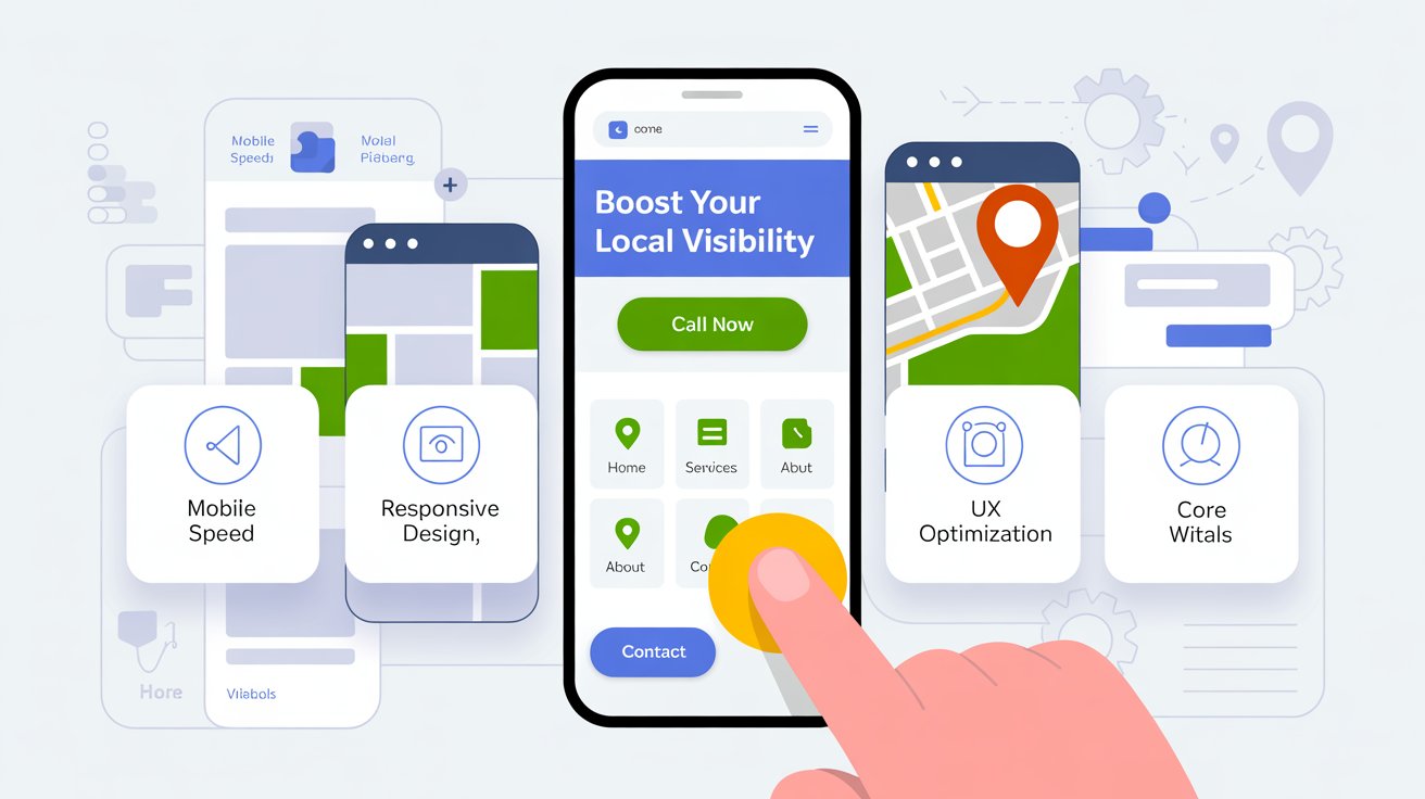
78% of local mobile searches lead to a purchase. Searches like "plumber near me" or "emergency HVAC repair" happen almost entirely on phones now, and Google ranks based on your mobile site, not your desktop one. If your site loads slow or fights someone on a small screen, it's costing you rankings and real calls.
How Google Actually Evaluates This
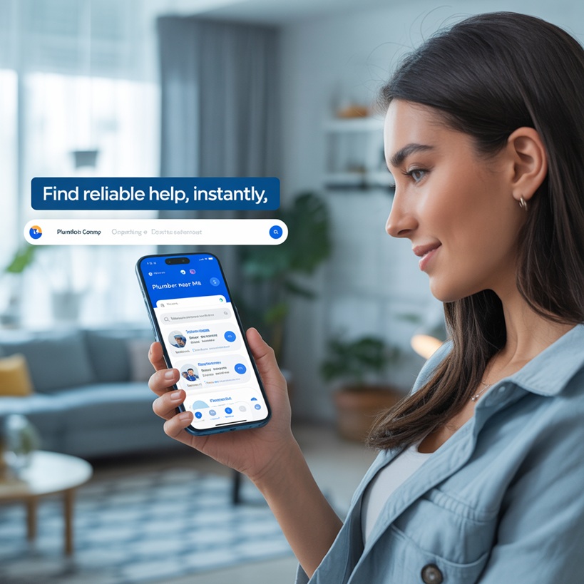
Google indexes your mobile site, not your desktop version, that's what "mobile-first indexing" means. It looks at whether your site adapts to different screens, how fast it loads on a mobile network, your Core Web Vitals (how fast content appears, how quickly it responds to a tap, whether things jump around while loading), how easy your buttons and links are to tap, how simple your navigation is, whether text is legible without zooming, and whether you're using intrusive popups. A poor mobile experience means higher bounce rates, and that drags your visibility down in the local pack.
What A Mobile-Ready Local Site Actually Needs
- A responsive design that actually adjusts for phones and tablets
- Click-to-call buttons visible on the homepage and every service page
- Google Maps integration with mobile-friendly directions
- Tappable service area links
- Load time under 3 seconds
- A sticky nav bar so your phone number or contact form is always reachable
- Minimal popups, nothing that blocks the content
- Forms with large fields and autofill support
- Service-specific landing pages built mobile-first
Free Tools To Check Your Own Site
- Google's Mobile-Friendly Test, quick check for usability issues like overlapping text or tiny links
- Google PageSpeed Insights, breaks down mobile vs. desktop performance with real fixes
- GTmetrix, a visual performance audit plus Core Web Vitals analysis
- Chrome DevTools (built into Chrome), simulate your site on different devices in real time
- WebPageTest.org, deeper testing for troubleshooting real issues
What A Real Fix Looks Like
A local plumbing company in Connecticut had a good-looking desktop site, but traffic and leads had flatlined. Google's Mobile-Friendly Test failed them on three counts: an 8.2 second load time, tap targets too close together, and content wider than the screen. Their Core Web Vitals were in the red.
After fixing it, load time dropped to 2.3 seconds, sticky call buttons went on every service page, the header navigation got simplified, and caching/lazy-loading got turned on. Within 45 days: bounce rate down 22%, mobile conversions up 37%, organic traffic up 61%.
No full redesign, just the right fixes, targeted at the right problems.
Mistakes That Cost You The Most
- Ignoring page speed. Slow load means people bounce, and bounced visitors don't call.
- Only testing on a desktop simulator. Actually open your site on your own phone.
- Popups that cover the content. These frustrate visitors and can trigger a real Google penalty.
- Tiny touch targets. Buttons need real size and spacing, if someone has to pinch-zoom to tap something, that's a fail.
- Overcomplicated navigation. Multi-level dropdowns are hard to use on a phone. Keep menus short.
Why This Actually Converts

A mobile site that works doesn't just help you rank, it helps you close the job. Click-to-call gets you immediate calls. Simple forms get more submissions. Integrated maps get more actual visits. And a site that just works, without friction, builds trust before you ever pick up the phone.
Bottom Line
Your mobile site is often someone's first real impression of your business. If it frustrates them, they bounce, and call the next name on the list. Start with the basics, speed, responsiveness, clickable CTAs, and go from there.
Want help checking your own site? Book a free discovery call.